The "Android vs. iOS" debate is as old as the smartphone itself. But for a product manager, it's not about picking a team. It's about analyzing two of the most successful products ever created and understanding their core philosophies. While I admire Apple's design and ecosystem, my daily driver is an Android phone. This choice comes down to a series of product decisions where I believe Android's focus on flexibility and user control creates a superior user experience.
1. Authentication: The Case of the Missing Fingerprint
Apple's Face ID is a marvel of engineering. When it works, it's seamless. The problem is the "when." As a product, authentication needs to be reliable in every context of a user's life. The lack of a fingerprint sensor on modern iPhones introduces significant friction in common scenarios: unlocking your phone first thing in the morning with your face half-buried in a pillow, accessing it while it's lying flat on a desk, or using it on a sunny day while wearing sunglasses. In these moments, the user is forced to perform awkward maneuvers or revert to a passcode, which is a security risk in public.
Android devices like the Google Pixel offer both Face Unlock and an under-display fingerprint sensor. This isn't just a feature; it's a product philosophy that prioritizes user choice and contextual convenience. It acknowledges that no single solution is perfect for every situation and empowers the user with the best tool for the moment. The COVID-19 pandemic, which made Face ID a daily frustration for mask-wearers for over two years, was a stark reminder of the fragility of a single-solution approach.
2. Navigation: The Inconsistent Back Gesture
A core principle of intuitive design is consistency. Users should be able to build a mental model of how a system works and apply it everywhere. Android's universal back gesture—a simple swipe from either edge of the screen—is a perfect example. It works in every app, on every screen. This consistency reduces cognitive load and makes navigation feel effortless.
iOS, in contrast, has a fragmented approach. While many apps support a swipe-from-left gesture, it's not universal. Too often, the user is forced to break their flow, stretch their thumb to a hard-to-reach back button in the top-left corner, and consciously think about how to perform a basic action. On today's large screens, this is a significant ergonomic failure and a clear point of user friction.
3. File Management: The Walled Garden
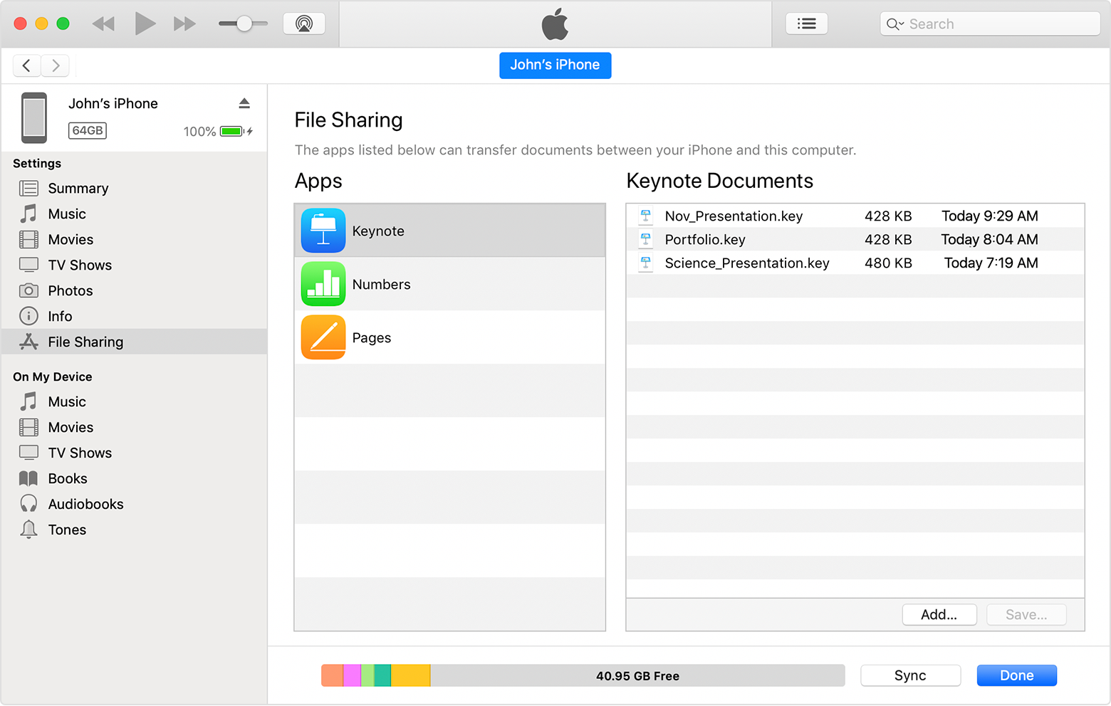
As a content creator for my YouTube channel, @walkwithshiba, this is my biggest frustration with iOS. After shooting a beautiful 10-minute video in Tokyo, I faced a surprisingly difficult challenge: getting the file onto my laptop. On Android, it's a simple drag-and-drop process. On iOS, it's a journey through iTunes, moving the files to iMovies, and confusing sync rules. This "walled garden" approach to file management feels arbitrary and user-hostile. It creates unnecessary steps and complexity for what should be a simple task, prioritizing ecosystem lock-in over user convenience.
4. App Settings: A Confusing Mental Model
Where do you go to change an app's settings? On Android, the answer is always the same: inside the app itself. This aligns with a user's natural mental model. If I want to change my camera settings, I open the Camera app. iOS breaks this model by placing many app-specific settings in the main phone Settings app. This creates a confusing user journey filled with guesswork. Do I open the app or hunt through a long list in the Settings menu? This inconsistency leads to poor discoverability of features and a frustrating user experience.
5. Notifications: A Tale of Two Philosophies
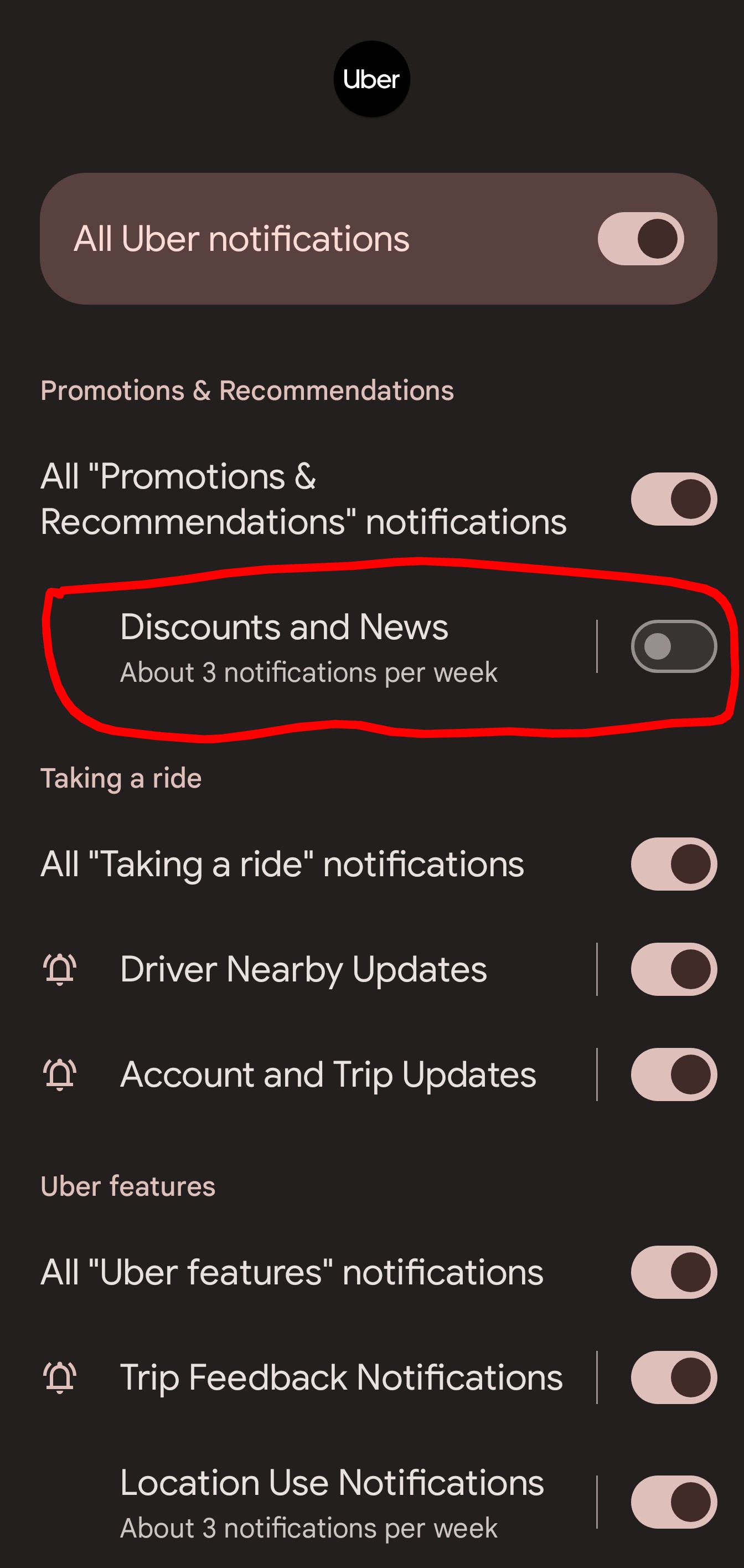
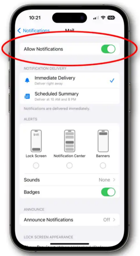
Android's product philosophy of user empowerment shines in its notification management. The ability to set granular controls for different types of notifications within a single app (e.g., turn off marketing but keep order updates) allows users to curate a high-signal, low-noise experience. The persistent notification icons in the status bar provide a convenient, at-a-glance summary of what needs attention. In contrast, iOS's all-or-nothing approach often leads to a cluttered notification center that users ignore entirely.
6. User Control: The Power of Choice
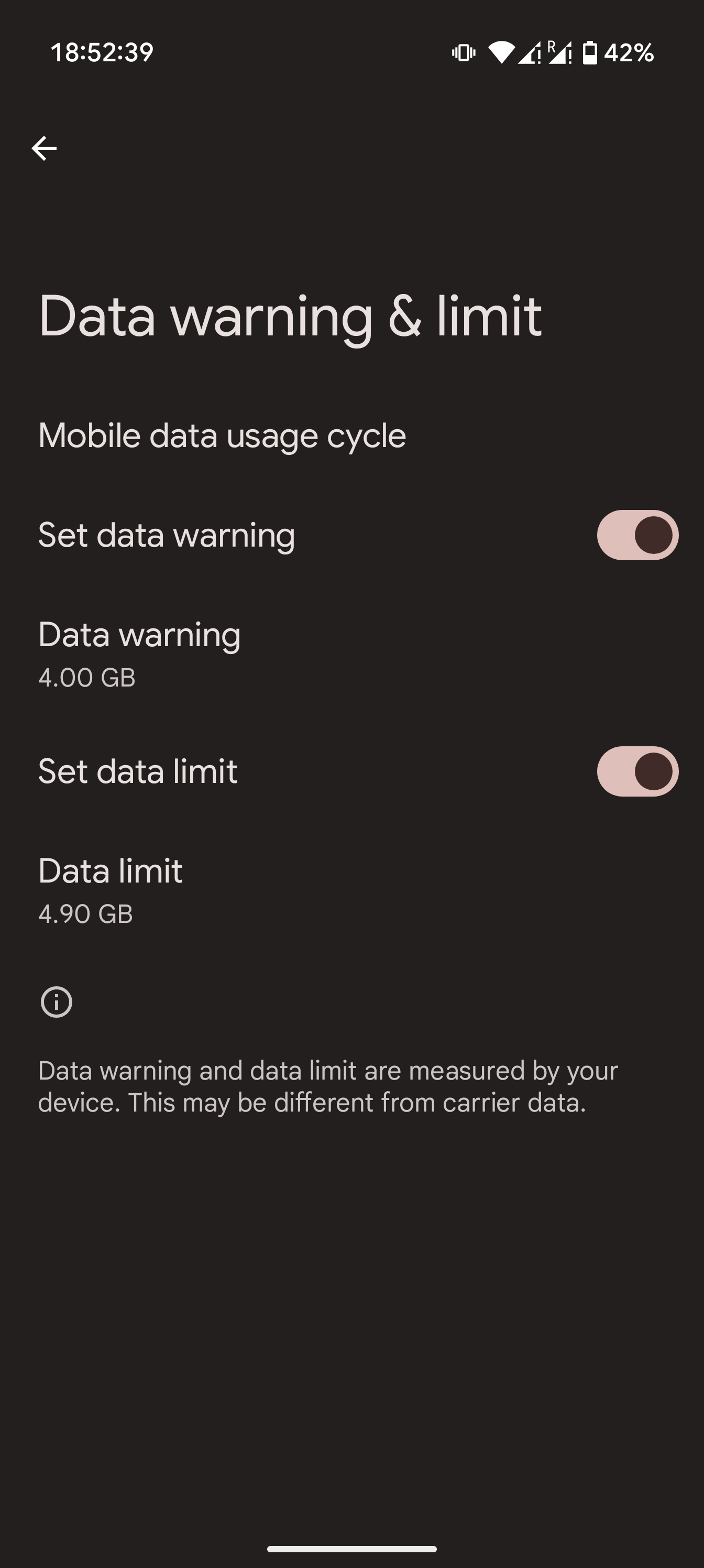
This philosophy of user empowerment extends to core system utilities. Take mobile data management. My data plan allows 5GB per month before incurring extra charges. On Android, I can natively set a data warning at 4GB and a hard limit at 4.9GB, ensuring I never get an unexpected bill. This simple, pro-consumer feature is surprisingly absent on iOS. It's a small detail, but it speaks volumes. It reflects a core product decision to trust users with granular control over their experience. If a feature like this were missing on Android, the open-source nature of the platform and its passionate community would likely produce an app to solve it - a flexibility that is a core strength of the ecosystem.